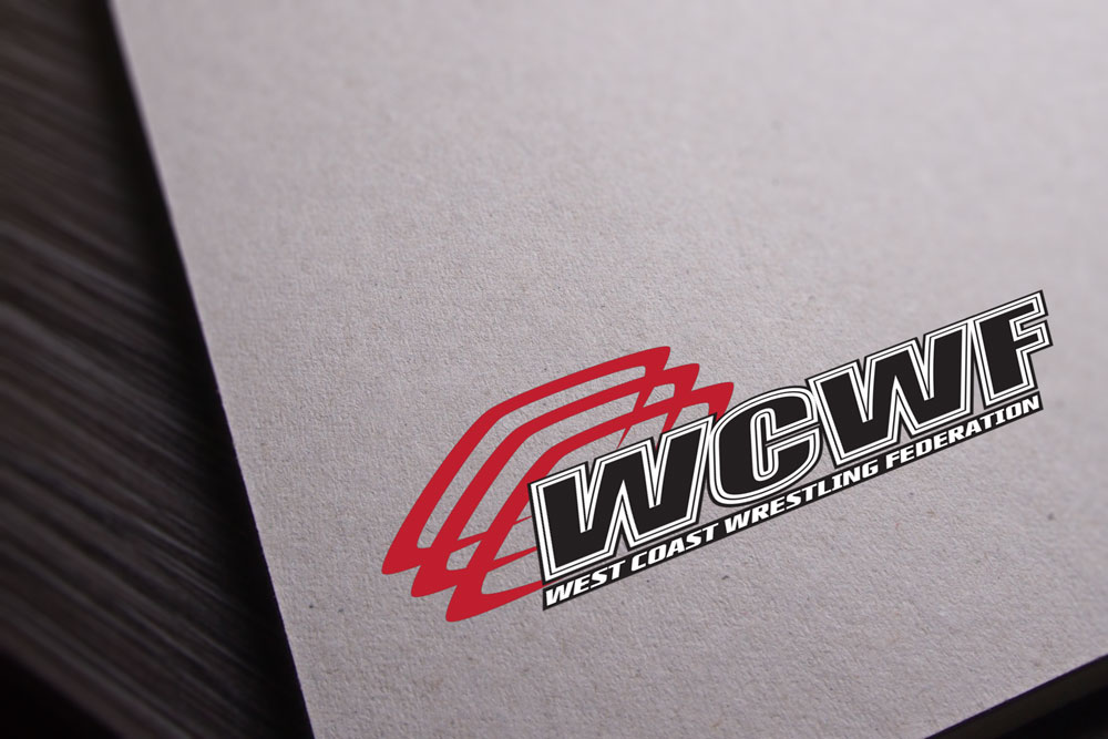
WCWF – Logo Design
Project Details
Client
West Coast Wrestling FederationSkills
Logo Design, Identity, & BrandingWebsite
WCWF Facebook PageProject Description
West Coast Wrestling Federation was a client from one of the two original founders of Aspire Graphics. The owner of West Coast Muscle was in the process of putting together a new and upcoming wrestling league and Steven (the other founder of Aspire Graphics) was a regular customer who worked out at that gym. It was only natural that we expressed interest in designing a logo for them and seeing what we could do help out!
The logo itself features two distinct colors that symbolize power and strong sense of attention – red and black. These colors made sense if you’ve ever watched a wrestling match; high emotions, strength, power are among many of the key words we came up with in designing the logo. We also chose to feature a key component in an arena – the three ropes that serve as the border of an arena and a key element when it came to specialty moves during a wrestling match. Lastly came the typography in which we chose a very strong font that created another key element associated with wrestling. Hand in hand all these elements combined create a uniqueness to it and a logo fitting of their league.
If you are ever in the Sacramento / Yuba area do check out their league as they always have events or matches coming up!

