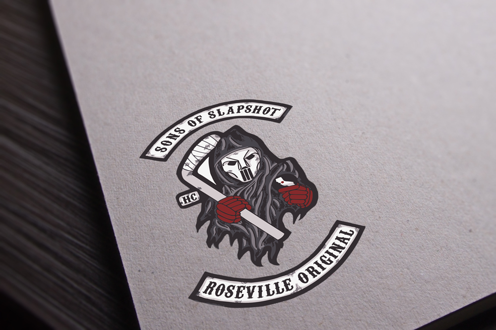
Sons of Slapshot – Logo Design
Project Details
Client
Sons of Slapshot Hockey TeamSkills
Logo Design, Identity, & BrandingProject Description
This logo was designed for Keith’s hockey team in collaboration with a fellow teammate, Adam Ray. While Adam initially drew out the idea on paper, Keith rendered and perfected the logo for print and can be seen on their jerseys.
The team was founded in 2017 with a group of people enrolled in a learn to play program in Roseville, CA. Having chemistry and the ambition to play hockey, a team was created with a full roster from that program. While many names and ideas were discussed and thought of, it was “Sons of Slapshot” that stood out among the rest. Of course the idea was initially a joke and just a skeptical idea, but everybody was on board with the name and idea of creating our own version of the Sons of Anarchy logo used on the popular TV series for a biker gang. Similar to their logo, we used a grim reaper holding a hockey stick and puck with hockey gloves instead. We also chose a font that was very similar to the “gangish” feel that the original logo had. Overall we were pleased the outcome of the logo and can be seen on the jerseys for the team. The colors of the jerseys also were handpicked to match the logo with using a maroon / reddish color with black and white highlights throughout.

